Thursday 1 May 2014

FLATPACKED


This week's been pretty eventful - see here for more about it. I've really enjoyed it, but found it also pretty stressful as it's part of my coursework for college - I also completely overestimated how difficult doing something like this is, and will be seriously glad for the chance to have a rest and not feel to tired to go to the gym this weekend! These drawings are part of the next step - I've done what I needed to do, now I need to make artwork out of it. I'm thinking about making some kind of zine, a product or some huge screenprints - I have to say I quite like the idea of having these gifs on television screens however. They're only quick, done in photoshop, but I'm pretty pleased with them - going to have a go at some with colour accents in a bit, so watch this space!


Tuesday 14 January 2014

DOUBLE EXPOSURE


First post of the New Year, so I'm going to start as I mean to go on - with a DIY! I've made this artwork for a unit at college myself, but it would also make a really nice present for a friend or a piece of artwork to hang on the wall!

So, what you'll need:
- Photoshop Elements, or Photoshop
- An image with a very light background, and the subject in shadow
- A watercolour or painting of a nebula, or a photo of one
- Paper
- A printer
- A photo frame

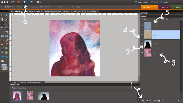
1. First, open a new document which is square in shape (I normally go for 20x20cm) and click the new layer button to add a new layer to it.
2. Copy your photograph of you or a friend onto this layer, and if necessary go to Enhance>Adjust Lighting>Levels to make the background lighter and the foreground darker. This layer should also be set to having 'Overlay' lighting using the drop down menu in the Layers toolbox.
3. Add a new layer and copy in your photograph of a nebula or a drawing of one (if you'd rather draw one, watercolours are best, because you can mix them up really well and experiment with lots of colours!). Move this layer beneath your portrait, and reduce its opacity until you are happy with how it looks.
4. Add a layer above your portrait, and fill it with a sandy, yellowy colour. Using the drop down menu again in the Layers toolbox, set it to 'pin light'.
5. Repeat step 4 but with a light blue colour, and then when you can see your picture, play with the opacity of these two coloured layers until you get the effect you want.
6. Save your picture as a .jpg file! You can then print it out, and frame it if you want (this one is particularly nice!). If you want it to be really good quality, maybe try printing it on watercolour paper or cartridge paper, or even on shiny photo paper depending on the look you want to go for!

(these are some examples of what you could end up with!)


Monday 30 December 2013

INVITATIONS

In March, it's my grandparents Golden Wedding Anniversary, which is going to involve some odd 80 family members and the place they had their Wedding Reception at originally all those years ago! They hadn't wanted to worry me with more to do in amongst all my school work and UCAS - still haven't sent off my application, aaargh! - but little did they know, I'd already drawn all this up! That was back in November, but whilst they were down here for Christmas we took some time sorting it all out properly. The top right image has been put into invitations, and all 3 put onto their menus for the day - but I think what we were all most pleased with is that we've made them ourselves from start to finish! I had a bit of trouble with my old, and pretty temperamental printer, but we got there in the end by experimenting with it, and the end result is that these were made all for the cost of a pack of A4 card from WHSmiths (about £2!), a printer cartridge and one of those mini guillotines (again, only like £5!). Shows what you can do with photoshop and a bit of creative DIY!

If you want to download the font I used, I got it here.
(quick picture of the finished thing!)

Saturday 23 November 2013

JEWELLERY


I finished my jewellery unit yesterday! Feel kinda sad about it because I've really enjoyed it, but it's encouraged me to keep on the craft and decorative arts route - all the way through this project my brain has been full of ideas and there was so much more I wish I could have made if I had more time! These are a few pictures of the finished things for my sketchbook, but I really don't think I can explain how proud of them I am - some of these pieces were so simple, but have turned out brilliantly and look really effective! I'm going to spend the rest of my evening watching Dr Who (super excited about it!) and filling out my sketchbooks - I'm starting to plan my final project now and notebooks are filling up fast! 

Friday 15 November 2013

FRUIT


(from left to right)
f/9 1/60
"
"
"
f/9 1/40
"
f/9 1/15
f/9 1/40
f/9 1/320
For these, we turned on a light box, and photographed different fruits. First, we worked with whole fruits by placing them on a sheet of paper and wrapping it up and above it to reflect the light down on the object. This made the fruit look sort of like it was floating, and the best example of it would be the 5th photograph above. We tried this effect with apples, oranges, pears and bananas, but I think the red colour of the apple meant it worked best at reflecting light properly and showing up really well.  We then started to cut up the fruit into sections, and lay it out over sheets of acetate to get light to shine through it. We found that just having a sheet of acetate made the fruit look quite shadowed when we photographed it, but by putting a sheet of white paper underneath the acetate, the light was dulled a bit and it made it a lot easier to photograph. I really like how the colours of the fruits worked together, and I think the best photos I took were some of the close ups with a really shallow depth of field - you can see all the other colours blurred in the background and it looks really lovely! I also think I prefer the photographs of the cut up fruit to whole fruits - they look a bit more abstract and decorative then just a single piece of fruit. We did try and make the single pieces of fruit slightly more interesting though by doing things like taking a bite out of them or slicing them up.

Thursday 14 November 2013

ILLUSTRATE

Illustrations of a few of my sculptures from school, getting into photoshop again recently and trying to use it a bit more for drawing!

Sunday 10 November 2013

CAKES

I'm beginning to make a serious effort to become a better cook - too often my cakes are pretty rubbish; I had one the other day that just collapsed which was pretty odd! I quite often improvise a bit too much, put ingredients in that aren't needed and it always ends in disaster - I really should learn from my mistakes more! These beautiful cakes were just normal sponge mixture, but we scooped out the middles and put in some homemade lemon curd and then added buttercream icing (which has a sneaky bit of lemon curd added to it!). They were delicious, and just to make it that bit better I was pretty happy with these photos!

Saturday 9 November 2013

RECTANGLES


A couple of pieces of jewellery I've nearly finished. I think it's been one of the best units I've done so far on my BTEC, because its so different and involved learning so much! We got to learn basic metalworking techniques at the beginning, but for the last couple of weeks have been designing our own jewellery and exploring all these techniques put together to make whatever we want. The designing and putting skills into practice has probably been the best bit, and I've actually been really proud of the stuff that I've made (it's all pieces I would wear myself, which I think is important because it makes it more personal!). In other news, I've been to an open day today and I think I may have found my perfect uni and course, which is really, really encouraging! I feel all inspired after it, and ready to get on with more projects at college just to get my portfolio looking great.

Wednesday 6 November 2013

SHAPES


At college we have a week where we make artwork to be sold in an exhibition - every piece is 10 x 10 inches and sells for £10. I had a few ideas for these and this is what I ended up with; lots of smudged about paint which made some really cool shapes. I've then mounted them on some really nice card, and overall I think they look really good - first piece of work I've made in a long time that I really like!

Sunday 3 November 2013

SAATCHI : PAPER


Having not been to an exhibition in a while, this was absolute bliss. Not only is the gallery really, really beautiful (pale wood and white walls and calm lighting, what's not to love?) but I was quite shocked by how much I enjoyed the artwork. There was so much difference from piece to piece and it was all really inspiring - these are just a small selection of the photographs that I took whilst I was there. I've been struggling to come up with any ideas for my own artwork recently, and it made me remember just how much looking at art and just spending time in galleries can really motivate you and help with being creative. My favourite piece is the last photograph, with all the different portraits - they're great, and despite all being so different just seem to match really well - but I would say it's definitely an exhibition which is worth going to see for all of the artwork in it.